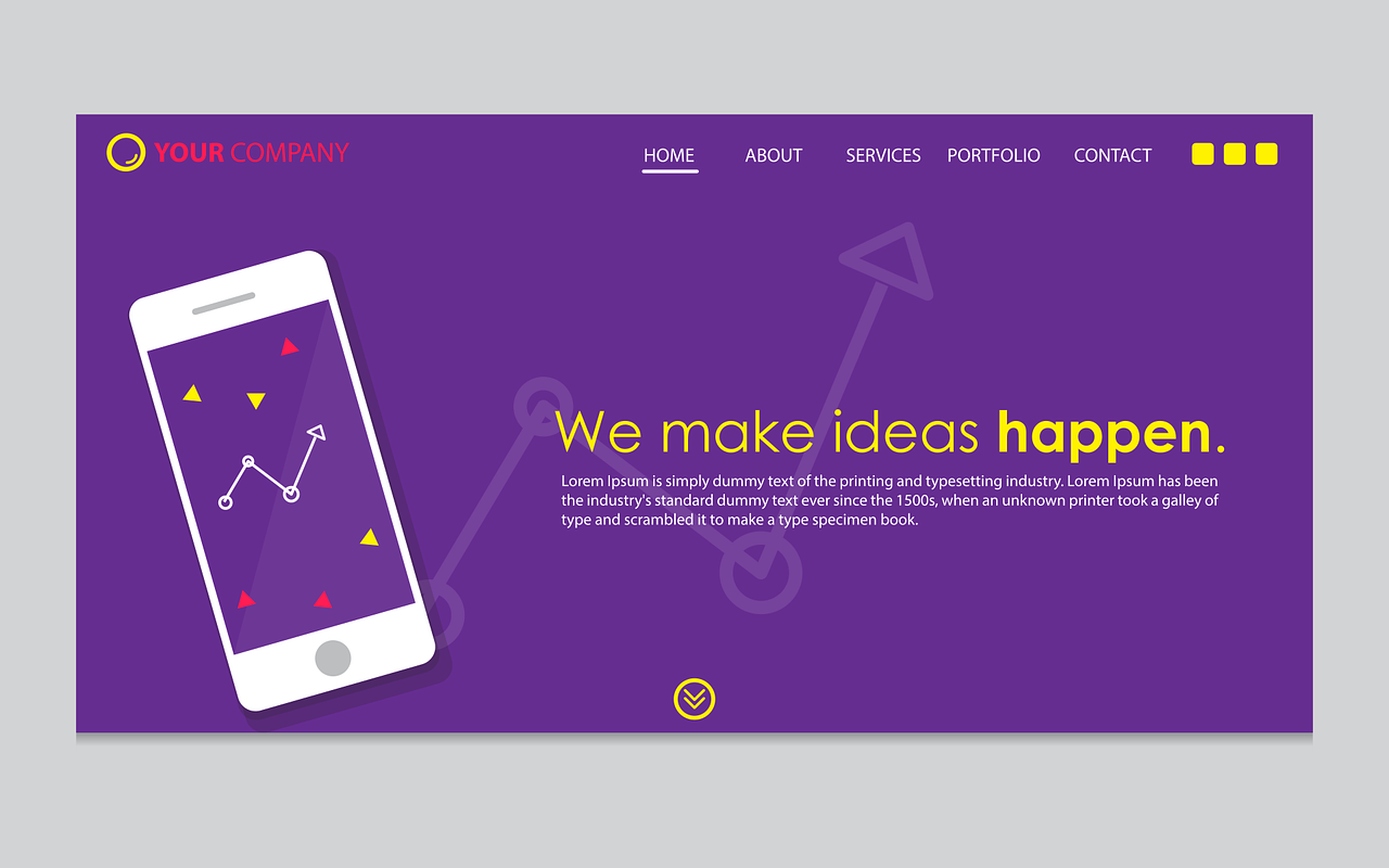
In the modern digital marketplace, the landing page of your website is the equivalent of the “front of the store.” Either customers will notice it, walk right in, and become fully engaged or they will take one glance and pass on by. Fortunately, websites have dominated in the way we do business long enough that trends of high converting landing pages have emerged. Here is a top 10 list.
1. Lead with your value proposition.
Making your value proposition immediately clear tops the list for a fundamental reason. If your audience does not understand right away “what’s in it for me?” they will not spend any more energy trying to figure it out.
2. Make it fast loading.
Pages that are slow to load do not retain audience attention. Your potential customer is more likely to navigate away than wait for your page to load. Ensure your website programming is effective.
3. Use a strong headline and optional subheading.
An impactful headline, and an optional supportive subheading, is a must-have for high conversion. Choose a short, concise message that gets the point across and piques curiosity.
4. Maintain SEO-supportive content.
Strong SEO (search engine optimization) ensures your website ranks in search results that contain keywords pointing to your content. Make a habit of continually analyzing SEO strategies and re-examining your content for potential improvements.
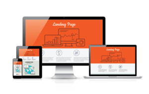 5. Ensure mobile responsiveness.
This is an important basic and foundational element of your website. If it is not mobile responsive, then potential customers browsing on their phones are likely to become frustrated and give up.
6. Use impactful images or videos.
The main goal of your landing page is to immediately capture and maintain attention from your audience. Make it visually interesting with high-quality images or engaging videos.
7. Make contact channels easy.
A great way to boost conversion is by making it as easy as possible for your potential customer to contact you. Contact forms that capture customer information, online chats that provide quick answers, and a “Contact” page that is clearly marked on your landing page are excellent ways to make it simple for your audience to engage with you.
8. Use a CTA button.
CTA (call to action) buttons are proven to be effective in conversion. They offer your customers fun and easy ways to engage in your website and immediately become part of an exchange with your brand. It makes the experience with you and your brand interactive from the start.
9. Use an information-capturing form.
Offer discounts, insider tips, or regular content from you through a subscription that site visitors sign up for. It adds immediate value for your customer by giving them something without having to purchase, while also capturing their information for more targeted follow-up and ongoing engagement. It ends up being a win-win and a great start to a relationship.
10. Create a clean, concise design.
Clutter forces the brain to expend more energy, and too many bells and whistles will work against you. Instead, choose a minimalistic design that delivers the highest impact possible with the least amount of distracting elements.
High-conversion landing pages don’t happen by chance and employing these tips will help ensure your page has a higher conversion rate. Enlisting the help of an experienced digital marketing and web design team will also make a difference—especially if this isn’t your area of expertise. Building high conversion landing pages is something we excel at. Contact Fuze7 today and find out how we can help you.
